


 Your new post is loading...

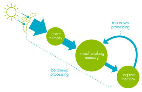

'Over the last couple of centuries, data visualisation has developed to the point where it is in everyday use across all walks of life. Many recognise it as an effective tool for both storytelling and analysis, overcoming most language and educational barriers. But why is this? How are abstract shapes and colours often able to communicate large amounts of data more effectively than a table of numbers or paragraphs of text?
An understanding of human perception will not only answer this question, but will also provide clear guidance and tools for improving the design of your own visualisations.
In order to understand how we are able to interpret data visualisations so effectively, we must start by examining the basics of how we perceive and process information, in particular visual information.'
Via Lauren Moss


De la memoria icónica a la memoria visual.
Interesting article, how our brain see data, possible implication for how mobile research apps are designed