Digital-News on Scoop.it today
635.1K views | +0 today
Follow
Digital-News on Scoop.it today
Your new post is loading...
Rescooped by Thomas Faltin from Ecom Revolution
Scoop.it!

The Lean Design Movement Changes How We Make Money Online

The Lean Design Movement Changes How We Make Money Online | Digital-News on Scoop.it today | Scoop.it

Meshing A V8 SLAP
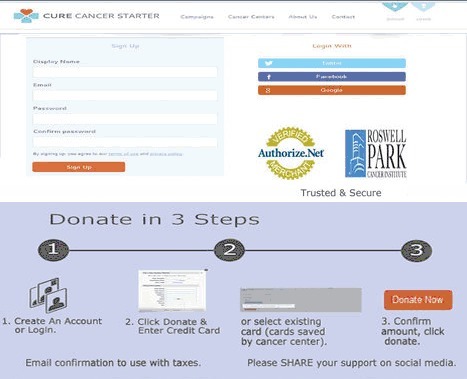
Had a V8 Slap today when I realized that the way Google has set up this new chess board doesn't favor the creation of new anything. When we started working on CureCancerStarter.org the chess board seemed to favor a User Generated Content (UGC) platform.

We wanted to create Kickstarter.com for cancer research. Great idea, but too late. Post Google's algorithm changes where social signals rule and trusted sources have all the high ground thinking in ways to fit YOURS into THEIRS is more productive and a better bet.

Important for ecommerce merchants to think in these terms:

* Appify.
* Widgetize.

* Gamify.

Ecommerce merchants may be the most impacted by these changes. Commerce can happen anywhere so why isn't it? Our merchant minds, I ran a sizable ecom website for 7 years, still focus on CASTLE building when we should be thinking about crowd converting.

Find ways to EMBED and MESH your ideas into already scaled systems and your idea, startup or site might just survive long enough to matter. One you matter you can think about castle building.


Via Martin (Marty) Smith
Thomas Faltin's comment, October 25, 2013 12:33 AM
Martin, you're welcome ... great content!
Martin (Marty) Smith's comment, October 25, 2013 12:36 AM
Thanks Thomas. Love that guy on your page. From a video game? Great art! M
Thomas Faltin's comment, October 25, 2013 12:58 AM
Martin, i'm the guy:-) no, i found it on the internet and yes, very great art!
Rescooped by Thomas Faltin from Ecom Revolution
Scoop.it!

5 #MustSteal Ecommerce Tricks From REI You Can Use THIS Holiday Season

5 #MustSteal Ecommerce Tricks From REI You Can Use THIS Holiday Season | Digital-News on Scoop.it today | Scoop.it
From backpacking to cycling to staying in shape and more, outfit your outdoor activities with the latest gear, clothing & footwear at REI.

Via Martin (Marty) Smith
Martin (Marty) Smith's curator insight, October 22, 2013 1:02 PM

5 Must Steals From REI
Here re five easy steals from http://www.rei.com that will increase your Holiday sales:

* Red DEAL or SALE button Far Right.

* Deal of the Day (you can put this anywhere).

* Loyalty Program (there are canned ones you can install).

* Trigger Point Free Shipping (below Login).

* BIG Search Box Next to logo.


Red Deals Button
REI.com is aware that the right side of a website can be a gutter. If you use the F design idea, and they do, and watch eyetracking you know you can manipulate a visitors eyes with things like a long horizontal menu bar. Since everyone clicks on DEALS REI.com puts it far right and in a somber red (to match their black menu bar).

Deal of the Day
REI.com's is above their footer in the middle (another potential gutter). DEAL shoppers will find that link no matter where you put it, so put it in a potential gutter and you convert "dead space" to ROI positive with a simple graphic and idea. At this time of year and with social media being so HUGE if you don't have a great Deal of the Day lined up you will suffer at the hands of the REI.com's.

Loyalty Program
I hesitated to put this in since installing a loyalty program can feel like invading Russia in the winter. Don't let it get that way. Buy a canned and simple loyalty program or create some easy way to reward your most loyal shoppers. If you can't get your website loyalty together by the holidays use your "Multi-Buyer" segment and serendipitous give them something no one else gets (via an email). Find your 80/20 rule (20% of your customers will do 80% of your sales) and REWARD the 20%.

Free Shipping Trigger
When I was a Director of Ecommerce my boss was so skeptical and worried about Free Shipping I had to do extensive analysis and tests. Here is what we found:

* Free Shipping Triggers are always exceeded by 40% or more.
* Free Shipping beats no Free Shipping every time.
* Make sure your Shipping Schedule is PRESENT and easy to understand.

REI.com's $50 Free Shipping probably produces an Average Order Value (AOV) of just under $100 (or more). Remove the objection (shipping costs are seen as a "don't buy" objection) and your buyers will buy. Interestingly all orders, all shipments FREE SHIPPING didn't always win. Seems Free Shipping is related to BUYER PSYCHOLOGY so some friction actually helps, some hurdle may help buyers feel special.

Big Search Box
My theory is REI.com's menu system is so complex they have to have great internal search. Even if your navigation is perfect expect half of your customers to want it their way (by using search). If you want to get really cool make sure you are merchandising your search sets with either faceted search or dynamic zones (zones you fill with content based on behavior or modeled analytics).


Rescooped by Thomas Faltin from Digital Strategy
Scoop.it!

5 Ecommerce Checkout Tips - How To DESIGN For More Conversions Next Year

5 Ecommerce Checkout Tips - How To DESIGN For More Conversions Next Year | Digital-News on Scoop.it today | Scoop.it

Via Martin (Marty) Smith, Seth Storey
Martin (Marty) Smith's curator insight, October 22, 2013 12:40 PM

CureCancerStarter.org Lessons In Checkout Mechanics
We did a lot of things right with our initial design of http://www.curecancerstarter.org our crowdfunding cancer research website, but there are some "checkout mechanics" that need tuning including:

* 1,2,3 Graphic.

* Trust Marks.

* Ability To SEE what is happening. 

* Too many Steps (superfluous information requested). 

* Doesn't FEEL Secure.


Your ecommerce or charity donations page should be in lockdown until next year. While checkout process changes can often bring the biggest ROI, they are to be avoided this close to a major deadline like 12.25.

1,2,3 Graphic
Always MAP your checkout process and then use a different color to indicate YOU ARE HERE. This repeatable graphic is a great TRUST creator and costs NOTHING other than the design time to create it.

Trust Marks
When I use the Authorize.net Trust Mark I DON'T use their widget. Widgets allow visitors to click on the Authorize.net logo and hear all about how great they are. NO ONE clicks on that link and the overhead for carrying the JavaScript is too high. I take a picture of the logo and use that (no link). If you must link to something link to your privacy policy, but be sure to include the same graphic at the top and begin with an explanation of the Trust Mark in your copy.

SEEING What Is Happening
Our current CureCancerStarter.org checkout has a popup to save a credit card. PopUps are horrible as they destroy confidence. Confidence is lost when customers can't SEE what they've done and how it relates to the end goal. "Relates to the end goal" is why the graphical map of your checkout process is so crucial.

Too Many STEPS
We have a profile creation page in our current checkout and we aren't doing anything with that data so a BIG NO NO. Don't PROFILE your customers during checkout since you will lose half of them. Profiling should be done via incentives and email marketing WHEN you have a curators need for the data (and not before). Once I can actually USE a picture of a CureCancerStarter.org donor THEN and ONLY THEN should that information be requested.

Must FEEL Secure
Trust Marks are so common no one sees them, but boy you sure see their ABSCENCE. Why make me wonder if you are secure. Slap a logo on your checkout and write the words TRUSTED and SECURE under them. Research shows the presence of the words is valuable as it provides context to the logos AND increases trust.

When we redesign CureCancerStarter.org's checkout I will be sure to share it so we can do a BEFORE and AFTER comparison (and a real graphic designer will polish my rough drafts).


Seth Storey's curator insight, October 23, 2013 12:15 PM

Great tips on good checkout design

Rescooped by Thomas Faltin from Must Design
Scoop.it!

5 Ecommerce Checkout Tips - How To DESIGN For More Conversions Next Year

5 Ecommerce Checkout Tips - How To DESIGN For More Conversions Next Year | Digital-News on Scoop.it today | Scoop.it

Via Martin (Marty) Smith
Martin (Marty) Smith's curator insight, October 22, 2013 12:40 PM

CureCancerStarter.org Lessons In Checkout Mechanics
We did a lot of things right with our initial design of http://www.curecancerstarter.org our crowdfunding cancer research website, but there are some "checkout mechanics" that need tuning including:

* 1,2,3 Graphic.

* Trust Marks.

* Ability To SEE what is happening. 

* Too many Steps (superfluous information requested). 

* Doesn't FEEL Secure.


Your ecommerce or charity donations page should be in lockdown until next year. While checkout process changes can often bring the biggest ROI, they are to be avoided this close to a major deadline like 12.25.

1,2,3 Graphic
Always MAP your checkout process and then use a different color to indicate YOU ARE HERE. This repeatable graphic is a great TRUST creator and costs NOTHING other than the design time to create it.

Trust Marks
When I use the Authorize.net Trust Mark I DON'T use their widget. Widgets allow visitors to click on the Authorize.net logo and hear all about how great they are. NO ONE clicks on that link and the overhead for carrying the JavaScript is too high. I take a picture of the logo and use that (no link). If you must link to something link to your privacy policy, but be sure to include the same graphic at the top and begin with an explanation of the Trust Mark in your copy.

SEEING What Is Happening
Our current CureCancerStarter.org checkout has a popup to save a credit card. PopUps are horrible as they destroy confidence. Confidence is lost when customers can't SEE what they've done and how it relates to the end goal. "Relates to the end goal" is why the graphical map of your checkout process is so crucial.

Too Many STEPS
We have a profile creation page in our current checkout and we aren't doing anything with that data so a BIG NO NO. Don't PROFILE your customers during checkout since you will lose half of them. Profiling should be done via incentives and email marketing WHEN you have a curators need for the data (and not before). Once I can actually USE a picture of a CureCancerStarter.org donor THEN and ONLY THEN should that information be requested.

Must FEEL Secure
Trust Marks are so common no one sees them, but boy you sure see their ABSCENCE. Why make me wonder if you are secure. Slap a logo on your checkout and write the words TRUSTED and SECURE under them. Research shows the presence of the words is valuable as it provides context to the logos AND increases trust.

When we redesign CureCancerStarter.org's checkout I will be sure to share it so we can do a BEFORE and AFTER comparison (and a real graphic designer will polish my rough drafts).


Seth Storey's curator insight, October 23, 2013 12:15 PM

Great tips on good checkout design