Digital-News on Scoop.it today
634.5K views | +190 today
Follow
Digital-News on Scoop.it today
Your new post is loading...
Rescooped by Thomas Faltin from Must Design
Scoop.it!

Contests Are KING - Web Design For Contests Example Inspires via @HomesDotCom

Contests Are KING - Web Design For Contests Example Inspires via @HomesDotCom | Digital-News on Scoop.it today | Scoop.it

Designing For Contests
I love home Homes.com doesn't kid around. They create CONTESTS not CONTENT. Why? Because contests have the added value of helping to create community too.

Erica Campbell Byrum How To Create Contests Video (start at 1:41)
http://sco.lt/6myquH VIDEO

Contest and games are FAVORITE engagement tactics because:

* They work (more new people come to play and share their playing).
* They are inexpensive WINNING is the main thing not the prizes.
* Contests have a LONG shelf life.
* Contests help unearth power Contributors and Social Supporters.


That last bullet speaks to the Gladwellian "Mavens, Salespeople and Connectors" tribes within your visitors. When you create a contest you will be visited by "contest trolls" and Ms. Byrum discusses how to deal with them in her video (link above).

This link is to Homes.com's Contest Page. This is a "Contest Splash" Page that shares the many simultaneous contests they run. I would add an ask for their "Blogger Ambassadors Program" too. They use contests to unearth their bloggers, but why not cut out the middle man and ask for those Ambassadors straight out?

Doesn't hurt to do both and I like have a page that explains the elite nature of our "buzz team". Don't think I'm saying Homes.com is missing it. They clearly GET the value of contests and you should STEAL the "ditch digging" design they do to "Splash Page" their contests.

Highly recommend watching Ms. Byrum too as her video is nothing if not comprehensive http://sco.lt/6myquH


Via Martin (Marty) Smith
No comment yet.
Rescooped by Thomas Faltin from Must Design
Scoop.it!

5 Web Design Ideas From A Non-Designer

5 Web Design Ideas From A Non-Designer | Digital-News on Scoop.it today | Scoop.it

Graphic Designers ROCK
I have more than tremendous respect and admiration for graphic designers. The ability to use tools like Photoshop and Illustrator to create MAGIC is something I will always envy. I know enough to know just how magical those skills truly are, so thank you.

I would LOVE to convince gifted visual marketers of the need to fix five mistakes I see over and over, mistakes that can HARM a websites bottom line and ability to scale.

I confess to making some of these mistakes myself. Easy to do when caught up in the NEW chase. I got so I printed out this list and keep it in view so it smacks me as a reminder while creating ideas for a new design.

Despite the list being omnipresent I forgot a subscription option on CrowdFunde.com two months ago, so EASY to forget these ideas:

** Email Subscription
Any websites lifeline is the LIST of supporters and subscribers they OWN. If Google changes their algorithm and PPC goes bankrupt you can always may your own list, so making sure the ability to opt in to that list is omnipresent is a CSF (Critical Success Factor).

** Keywords In Category Names
Think, "Do we want to win that keyword," when reviewing your navigation. You may select to have your URLs rewritten to be more keyword specific, but those internal links play an important role with Google's spider and SEO so KEYWORDS are a must.

** Research Keywords
My CrowdFunde co-founder Phil Buckley asked me if I thought attorneys or lawyers would be the most searched term. "Lawyers," I answered confidently knowing I was wrong (you never win these who will win questions lol). Attorneys is the winner and by a large margin. Don't write copy to what you THINK when it is so easy to do a little research and KNOW.

** The Tricky Part To Web Analytics
Here's the rub to web metrics. They operate in a constant seesaw dance with one another. Attorneys may be the most searched, but maybe that is because the Mass Tort guys have crushed the deck in some way (have no knowledge of that only using it as an example so please don't sue me lol). When you DESIGN with numbers you design better, but be sure to ask your SEO contact where the rubs are in the numbers. Rubs are numbers that LOOK one way but actually ARE another. Trust me you NEVER want to spend the kind of time in Google Analytics knowing where the rubs are requires, so ask.

** 80/20 Rule
One Internet marketing FRACTAL we discovered is 20% of the links, traffic, pages always get 80% or more of the value. Your job is to build a flexible framework so when your managing team SEES the emerging 80/20 rule you can easily shift the presentation to favor the 20 over the 80.

Now please take these practical, money making ideas and make them beautiful and THANK YOU for your dedication to BEAUTY in design and life :). Marty


Via Martin (Marty) Smith
No comment yet.
Rescooped by Thomas Faltin from Must Design
Scoop.it!

Top 10 Design Revolution Scoops of All Time

Top 10 Design Revolution Scoops of All Time | Digital-News on Scoop.it today | Scoop.it

Via Martin (Marty) Smith
Martin (Marty) Smith's curator insight, October 27, 2013 5:37 PM

Top 10 Design Revolution Scoops of All Time

http://sco.lt/7FcZ4T Infographic - Color Is Master Of Us All

http://sco.lt/59W02L Blog Post - 20 Web Design Trends In 2013 From Responsive To Storytelling

http://sco.lt/6HpSpF Blog Post - Top 10 B2B Website Designs


http://sco.lt/6gwzxp Blog Post - Learning GREAT Website Design From Websites That Suck


http://sco.lt/8bGgwD Infographic - Latest Trends in Web Design

http://sco.lt/7Dw7ov Blog Post - Pledge Allegiance To The Red, Black and White Website Designs For Inspiration

http://sco.lt/5deXxZ Infographic - The Role of Color in Marketing

http://sco.lt/7MBTaj Infographic - The Complete Guide to Color Psychology

http://sco.lt/6VSW7F Blog Post - 8 UI, UX Tips For Amazing Software or Website Development


http://sco.lt/8CIlEn Blog Post - Roundup of Top 10 Best Websites For Designers - How Magazine

Creating a Scoopit Content Marketing Conversion Study. Learn more: http://sco.lt/69HeAj

Rescooped by Thomas Faltin from Identité visuelle
Scoop.it!

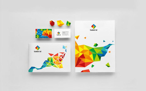
Tsukor 3D : Brand Identity

Tsukor 3D : Brand Identity | Digital-News on Scoop.it today | Scoop.it

"Lviv, Ukraine based agency Happy Design created the brand identity for Tsukor 3D, a Ukrainian 3D studio. The key visual is a combination of several polygons, which is typical for 3D modeling. Brief was to design a colorful, trending, professional, warm and friendly brand identity. Mission accomplished!'


Via Bad Spoon
Bad Spoon's curator insight, October 26, 2013 4:18 AM

Le logo est un peu confus, mais j’aime beaucoup l’ensemble de cette identité visuelle (décidément, les assemblages de polygones sont très tendances…)

Scooped by Thomas Faltin
Scoop.it!

The Lean Design Movement Book Project - Publishing A Book In 3 Weeks (Submission Deadline 10.31)

The Lean Design Movement Book Project - Publishing A Book In 3 Weeks (Submission Deadline 10.31) | Digital-News on Scoop.it today | Scoop.it
No comment yet.
Rescooped by Thomas Faltin from Startup Revolution
Scoop.it!

Lean Design Movement: Why Web Designers Will Design Less And Collaborate More

Lean Design Movement: Why Web Designers Will Design Less And Collaborate More | Digital-News on Scoop.it today | Scoop.it
Create Conversations NOT Websites A V8 SLAP About State Of Web Design TODAY
Wow what a HUGE realization today working on http://www.curecancerstarter.org.…...

Via Martin (Marty) Smith
Martin (Marty) Smith's curator insight, October 24, 2013 2:04 PM

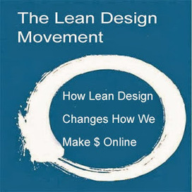
I lifted Eric Ries' Lean Startup book cover on purpose. Today I realized that what a #startup actually IS has changed a lot. Lisa Gansky hinted at these changes in her book Meshing It, but creating http://www.curecancerstarter.org is making the need to design conversations and collaborate with existing scaled partners a clear WINNER for any startup.

GOOGLE is the reason. Google's system now rewards existing trusted site almost to the exclusion of everyone else. Startups don't have the TIME needed to create the TRUST required so find a partner and hop on their back... at least for a little bit while you are through the now very brutal MVP (minimal viable product) phase. 

Rescooped by Thomas Faltin from Ecom Revolution
Scoop.it!

5 #MustSteal Ecommerce Tricks From REI You Can Use THIS Holiday Season

5 #MustSteal Ecommerce Tricks From REI You Can Use THIS Holiday Season | Digital-News on Scoop.it today | Scoop.it
From backpacking to cycling to staying in shape and more, outfit your outdoor activities with the latest gear, clothing & footwear at REI.

Via Martin (Marty) Smith
Martin (Marty) Smith's curator insight, October 22, 2013 1:02 PM

5 Must Steals From REI
Here re five easy steals from http://www.rei.com that will increase your Holiday sales:

* Red DEAL or SALE button Far Right.

* Deal of the Day (you can put this anywhere).

* Loyalty Program (there are canned ones you can install).

* Trigger Point Free Shipping (below Login).

* BIG Search Box Next to logo.


Red Deals Button
REI.com is aware that the right side of a website can be a gutter. If you use the F design idea, and they do, and watch eyetracking you know you can manipulate a visitors eyes with things like a long horizontal menu bar. Since everyone clicks on DEALS REI.com puts it far right and in a somber red (to match their black menu bar).

Deal of the Day
REI.com's is above their footer in the middle (another potential gutter). DEAL shoppers will find that link no matter where you put it, so put it in a potential gutter and you convert "dead space" to ROI positive with a simple graphic and idea. At this time of year and with social media being so HUGE if you don't have a great Deal of the Day lined up you will suffer at the hands of the REI.com's.

Loyalty Program
I hesitated to put this in since installing a loyalty program can feel like invading Russia in the winter. Don't let it get that way. Buy a canned and simple loyalty program or create some easy way to reward your most loyal shoppers. If you can't get your website loyalty together by the holidays use your "Multi-Buyer" segment and serendipitous give them something no one else gets (via an email). Find your 80/20 rule (20% of your customers will do 80% of your sales) and REWARD the 20%.

Free Shipping Trigger
When I was a Director of Ecommerce my boss was so skeptical and worried about Free Shipping I had to do extensive analysis and tests. Here is what we found:

* Free Shipping Triggers are always exceeded by 40% or more.
* Free Shipping beats no Free Shipping every time.
* Make sure your Shipping Schedule is PRESENT and easy to understand.

REI.com's $50 Free Shipping probably produces an Average Order Value (AOV) of just under $100 (or more). Remove the objection (shipping costs are seen as a "don't buy" objection) and your buyers will buy. Interestingly all orders, all shipments FREE SHIPPING didn't always win. Seems Free Shipping is related to BUYER PSYCHOLOGY so some friction actually helps, some hurdle may help buyers feel special.

Big Search Box
My theory is REI.com's menu system is so complex they have to have great internal search. Even if your navigation is perfect expect half of your customers to want it their way (by using search). If you want to get really cool make sure you are merchandising your search sets with either faceted search or dynamic zones (zones you fill with content based on behavior or modeled analytics).


Rescooped by Thomas Faltin from The MarTech Digest
Scoop.it!

E-commerce Eye Candy - A Guide to Webpage Anatomy [Infographic] - Building Keystones | #TheMarketingAutomationAlert

E-commerce Eye Candy - A Guide to Webpage Anatomy [Infographic] - Building Keystones | #TheMarketingAutomationAlert | Digital-News on Scoop.it today | Scoop.it
This e-commerce infographic shows that it is vital to incorporate SEO and UX into the design of your webpage.


___________________________________

-Receive a FREE daily summary of The Marketing Technology Alert directly to your inbox. To subscribe, please go to http://ineomarketing.com/About_The_MAR_Sub.html  (your privacy is protected).

-If you like this scoop from The Marketing Technology Alert (brought to you by iNeoMarketing), PLEASE share by using the links below.


Via Marteq
Marteq's curator insight, October 21, 2013 6:56 PM

Although B2C oriented, it definitely has a play in B2B, especially with the growth of B2B eCommerce.

Rescooped by Thomas Faltin from The MarTech Digest
Scoop.it!

Web Design Trends for 2013 | Enfuzed | #TheMarketingAutomationAlert

Web Design Trends for 2013 | Enfuzed | #TheMarketingAutomationAlert | Digital-News on Scoop.it today | Scoop.it
A infographic featuring web design trends for 2013 created by Enfuzed. This is the original!


___________________________________

-Receive a FREE daily summary of The Marketing Technology Alert directly to your inbox. To subscribe, please go to http://ineomarketing.com/About_The_MAR_Sub.html  (your privacy is protected).

-If you like this scoop from The Marketing Technology Alert (brought to you by iNeoMarketing), PLEASE share by using the links below.


Via Marteq
Marteq's curator insight, October 7, 2013 9:28 PM

Metro is taking off. See WebByDesign for templates.

Rescooped by Thomas Faltin from Cultivating Community
Scoop.it!

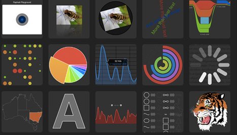
The top 20 data visualisation tools

The top 20 data visualisation tools | Digital-News on Scoop.it today | Scoop.it

From simple charts to complex maps and infographics, Brian Suda's round-up of the best – and mostly free – tools has everything you need to bring your data to life...

A common question is how to get started with data visualisations. Beyond following blogs, you need to practice – and to practice, you need to understand the tools available. In this article, get introduced to 20 different tools for creating visualisations...


Via Lauren Moss, Baiba Svenca, eRelations, zapleahy
Randy Rebman's curator insight, January 28, 2013 12:33 PM

This looks like it might be a good source for integrating infographics into the classroom.

Rescooped by Thomas Faltin from Curation Revolution
Scoop.it!

13 Easy Fix Ecommerce Mistakes And 2 Toughies For Holiday 2012

13 Easy Fix Ecommerce Mistakes And 2 Toughies For Holiday 2012 | Digital-News on Scoop.it today | Scoop.it
15 Common Mistakes in E-Commerce Design and How to Avoid Them (via @smashingmag) - Selling online can open up huge new markets for many businesses.

...

Marty Note
These are all great tips. I've had to, at one time or another, correct them all. There are several low hanging fruit easy to fix tips like making sure people know where you are (your contact information should be ways to find and not a PO box) and making sure your return information is easy to search, find or popup.

Inside the easy, low hanging fruit are two tough but valuable ideas:

* Internal Search
* Shopping Cart

Search touched about half of our sales when I was a Director of Ecommerce. Some say great navigation can eliminate search. I don't agree. We live in a search culture thanks to Google so people are going to search your site. Using search to build and merchandise highly effective landing pages is an ecommerce MUST.

There used to be great SaaS tools you could add into your site like Endeca. Now most CMS build in some of those expensive features. I'm a Director of Marketing at Atlantic BT ( http://www.atlanticbt.com ). We've done about 50 Magento installations and Love the platform for its sheer POWER. Magento has many of Endeca's better ideas in their CMS or you can buy plugins to augment this open source platform.

Shopping cart's take sophisticated A/B testing at last and, if you have the budget, multivariate testing (MVT). True MVT creates a regression analysis of all possible variables and provides the best combinations of alternatives. Small tweaks in the cart can mean millions so I recommend using MVT testing tools such as Adobe's Test and Target to get an accurate read. Never blunder into cart renovations since you would be violating first law of Internet marketing, "DO NO HARM."

So tackle all of these ideas, but understand the article mixes the complicated with the easy :).M


Via Martin (Marty) Smith
No comment yet.
Rescooped by Thomas Faltin from Public Relations & Social Marketing Insight
Scoop.it!

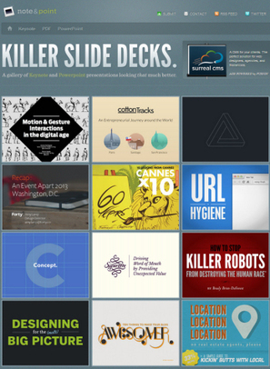
5 Cool PowerPoint Slide Design Tools

5 Cool PowerPoint Slide Design Tools | Digital-News on Scoop.it today | Scoop.it

Are you hankering to give your PowerPoint presentations a visual boost? Do you want to get away from the "I did this in PowerPoint look" that you (and everyone else) get from using PowerPoint's built in templates? Do you need a timeline slide or help finding graphics to illustrate your slide content?


If you answer yes to any of these questions, then take a look at these five great—and free—design tools. They can help you enhance your PowerPoint presentations and speed up the design process.


Via Baiba Svenca, Jeff Domansky
Cynthia Day's curator insight, July 30, 2014 2:47 PM

pp

Athena Catedral's curator insight, August 6, 2014 3:52 AM

Because a good idea will go to waste if you can't present it right. 

becool's curator insight, August 21, 2014 7:51 AM
Voor wie nog graag ppt presentaties maakt, kan dit een manier zijn om er meer variatie in te integreren. Leve Prezi :)
Scooped by Thomas Faltin
Scoop.it!

Help Animate Special Mission of CureCancerStarter.org via 99Designs

Help Animate Special Mission of CureCancerStarter.org via 99Designs | Digital-News on Scoop.it today | Scoop.it

We've received a lot of great feedback in CureCancerStarter.org's first 10 days. Some of that feedback tells us our current homepage video works better as an About Us video than an explanation of what crowdfunding cancer research is about and why the new cancer research revolution is so important.

If you are a graphic designer who can animate we hope you will apply and win our 99Designs contest.


No comment yet.
Rescooped by Thomas Faltin from Must Design
Scoop.it!

Top 10 Design Revolution Scoops of All Time

Top 10 Design Revolution Scoops of All Time | Digital-News on Scoop.it today | Scoop.it

Via Martin (Marty) Smith
Martin (Marty) Smith's curator insight, October 27, 2013 5:37 PM

Top 10 Design Revolution Scoops of All Time

http://sco.lt/7FcZ4T Infographic - Color Is Master Of Us All

http://sco.lt/59W02L Blog Post - 20 Web Design Trends In 2013 From Responsive To Storytelling

http://sco.lt/6HpSpF Blog Post - Top 10 B2B Website Designs


http://sco.lt/6gwzxp Blog Post - Learning GREAT Website Design From Websites That Suck


http://sco.lt/8bGgwD Infographic - Latest Trends in Web Design

http://sco.lt/7Dw7ov Blog Post - Pledge Allegiance To The Red, Black and White Website Designs For Inspiration

http://sco.lt/5deXxZ Infographic - The Role of Color in Marketing

http://sco.lt/7MBTaj Infographic - The Complete Guide to Color Psychology

http://sco.lt/6VSW7F Blog Post - 8 UI, UX Tips For Amazing Software or Website Development


http://sco.lt/8CIlEn Blog Post - Roundup of Top 10 Best Websites For Designers - How Magazine

Creating a Scoopit Content Marketing Conversion Study. Learn more: http://sco.lt/69HeAj

Scooped by Thomas Faltin
Scoop.it!

The Lean Design Movement Book Project - Publishing A Book In 3 Weeks (Submission Deadline 10.31)

The Lean Design Movement Book Project - Publishing A Book In 3 Weeks (Submission Deadline 10.31) | Digital-News on Scoop.it today | Scoop.it
No comment yet.
Rescooped by Thomas Faltin from Ecom Revolution
Scoop.it!

The Lean Design Movement Changes How We Make Money Online

The Lean Design Movement Changes How We Make Money Online | Digital-News on Scoop.it today | Scoop.it

Meshing A V8 SLAP
Had a V8 Slap today when I realized that the way Google has set up this new chess board doesn't favor the creation of new anything. When we started working on CureCancerStarter.org the chess board seemed to favor a User Generated Content (UGC) platform.

We wanted to create Kickstarter.com for cancer research. Great idea, but too late. Post Google's algorithm changes where social signals rule and trusted sources have all the high ground thinking in ways to fit YOURS into THEIRS is more productive and a better bet.

Important for ecommerce merchants to think in these terms:

* Appify.
* Widgetize.

* Gamify.

Ecommerce merchants may be the most impacted by these changes. Commerce can happen anywhere so why isn't it? Our merchant minds, I ran a sizable ecom website for 7 years, still focus on CASTLE building when we should be thinking about crowd converting.

Find ways to EMBED and MESH your ideas into already scaled systems and your idea, startup or site might just survive long enough to matter. One you matter you can think about castle building.


Via Martin (Marty) Smith
Thomas Faltin's comment, October 25, 2013 12:33 AM
Martin, you're welcome ... great content!
Martin (Marty) Smith's comment, October 25, 2013 12:36 AM
Thanks Thomas. Love that guy on your page. From a video game? Great art! M
Thomas Faltin's comment, October 25, 2013 12:58 AM
Martin, i'm the guy:-) no, i found it on the internet and yes, very great art!
Rescooped by Thomas Faltin from Digital Strategy
Scoop.it!

5 Ecommerce Checkout Tips - How To DESIGN For More Conversions Next Year

5 Ecommerce Checkout Tips - How To DESIGN For More Conversions Next Year | Digital-News on Scoop.it today | Scoop.it

Via Martin (Marty) Smith, Seth Storey
Martin (Marty) Smith's curator insight, October 22, 2013 12:40 PM

CureCancerStarter.org Lessons In Checkout Mechanics
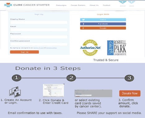
We did a lot of things right with our initial design of http://www.curecancerstarter.org our crowdfunding cancer research website, but there are some "checkout mechanics" that need tuning including:

* 1,2,3 Graphic.

* Trust Marks.

* Ability To SEE what is happening. 

* Too many Steps (superfluous information requested). 

* Doesn't FEEL Secure.


Your ecommerce or charity donations page should be in lockdown until next year. While checkout process changes can often bring the biggest ROI, they are to be avoided this close to a major deadline like 12.25.

1,2,3 Graphic
Always MAP your checkout process and then use a different color to indicate YOU ARE HERE. This repeatable graphic is a great TRUST creator and costs NOTHING other than the design time to create it.

Trust Marks
When I use the Authorize.net Trust Mark I DON'T use their widget. Widgets allow visitors to click on the Authorize.net logo and hear all about how great they are. NO ONE clicks on that link and the overhead for carrying the JavaScript is too high. I take a picture of the logo and use that (no link). If you must link to something link to your privacy policy, but be sure to include the same graphic at the top and begin with an explanation of the Trust Mark in your copy.

SEEING What Is Happening
Our current CureCancerStarter.org checkout has a popup to save a credit card. PopUps are horrible as they destroy confidence. Confidence is lost when customers can't SEE what they've done and how it relates to the end goal. "Relates to the end goal" is why the graphical map of your checkout process is so crucial.

Too Many STEPS
We have a profile creation page in our current checkout and we aren't doing anything with that data so a BIG NO NO. Don't PROFILE your customers during checkout since you will lose half of them. Profiling should be done via incentives and email marketing WHEN you have a curators need for the data (and not before). Once I can actually USE a picture of a CureCancerStarter.org donor THEN and ONLY THEN should that information be requested.

Must FEEL Secure
Trust Marks are so common no one sees them, but boy you sure see their ABSCENCE. Why make me wonder if you are secure. Slap a logo on your checkout and write the words TRUSTED and SECURE under them. Research shows the presence of the words is valuable as it provides context to the logos AND increases trust.

When we redesign CureCancerStarter.org's checkout I will be sure to share it so we can do a BEFORE and AFTER comparison (and a real graphic designer will polish my rough drafts).


Seth Storey's curator insight, October 23, 2013 12:15 PM

Great tips on good checkout design

Rescooped by Thomas Faltin from Must Design
Scoop.it!

5 Ecommerce Checkout Tips - How To DESIGN For More Conversions Next Year

5 Ecommerce Checkout Tips - How To DESIGN For More Conversions Next Year | Digital-News on Scoop.it today | Scoop.it

Via Martin (Marty) Smith
Martin (Marty) Smith's curator insight, October 22, 2013 12:40 PM

CureCancerStarter.org Lessons In Checkout Mechanics
We did a lot of things right with our initial design of http://www.curecancerstarter.org our crowdfunding cancer research website, but there are some "checkout mechanics" that need tuning including:

* 1,2,3 Graphic.

* Trust Marks.

* Ability To SEE what is happening. 

* Too many Steps (superfluous information requested). 

* Doesn't FEEL Secure.


Your ecommerce or charity donations page should be in lockdown until next year. While checkout process changes can often bring the biggest ROI, they are to be avoided this close to a major deadline like 12.25.

1,2,3 Graphic
Always MAP your checkout process and then use a different color to indicate YOU ARE HERE. This repeatable graphic is a great TRUST creator and costs NOTHING other than the design time to create it.

Trust Marks
When I use the Authorize.net Trust Mark I DON'T use their widget. Widgets allow visitors to click on the Authorize.net logo and hear all about how great they are. NO ONE clicks on that link and the overhead for carrying the JavaScript is too high. I take a picture of the logo and use that (no link). If you must link to something link to your privacy policy, but be sure to include the same graphic at the top and begin with an explanation of the Trust Mark in your copy.

SEEING What Is Happening
Our current CureCancerStarter.org checkout has a popup to save a credit card. PopUps are horrible as they destroy confidence. Confidence is lost when customers can't SEE what they've done and how it relates to the end goal. "Relates to the end goal" is why the graphical map of your checkout process is so crucial.

Too Many STEPS
We have a profile creation page in our current checkout and we aren't doing anything with that data so a BIG NO NO. Don't PROFILE your customers during checkout since you will lose half of them. Profiling should be done via incentives and email marketing WHEN you have a curators need for the data (and not before). Once I can actually USE a picture of a CureCancerStarter.org donor THEN and ONLY THEN should that information be requested.

Must FEEL Secure
Trust Marks are so common no one sees them, but boy you sure see their ABSCENCE. Why make me wonder if you are secure. Slap a logo on your checkout and write the words TRUSTED and SECURE under them. Research shows the presence of the words is valuable as it provides context to the logos AND increases trust.

When we redesign CureCancerStarter.org's checkout I will be sure to share it so we can do a BEFORE and AFTER comparison (and a real graphic designer will polish my rough drafts).


Seth Storey's curator insight, October 23, 2013 12:15 PM

Great tips on good checkout design

Rescooped by Thomas Faltin from Must Design
Scoop.it!

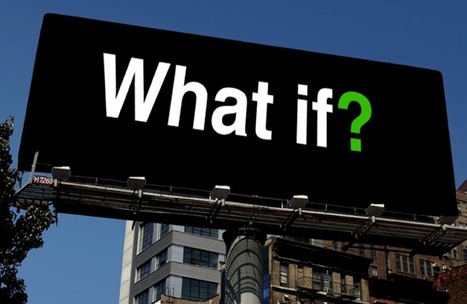
Designing For WHAT IF: Why Website Designers Are About TO DESIGN LESS

Designing For WHAT IF: Why Website Designers Are About TO DESIGN LESS | Digital-News on Scoop.it today | Scoop.it

Via Martin (Marty) Smith
Martin (Marty) Smith's curator insight, October 14, 2013 9:18 PM

Working on http://www.curecancerstarter.org has been a lesson in web 3.0. Not QUITE here yet but BIG hints of What's Next include:

* The Cloud changes what and how we store.
* When you change what we store you change information architecture.
* You can see the beginning of "appification" of everything (smaller amounts of code executed faster and then updated frequently).
* Websites are becoming contingent on two THEMS (visitors and users of the Content Management System backend).

This last bullet is where the real design revolution lives. Once we design "what if, then..." contingent frameworks based on the needs of visitors (fully modeled based on personas and segments) and those using the CMS we've built we are DESIGNING less and THINKING more.

Each time we've placed limits on how our CMS will be used we've seen the need for LESS structure and more freedom. The logic of WHAT IT, THEN.... dictates a different approach to "designing a website".

This new approach will be less DESIGN and more flexibility, frameworks and user controlled functionality. Web designers, and this is not a new idea from me LOL, are becoming more like video game designers creating environments and contingent presentations.

So prepare to DESIGN less and LISTEN more as you use the new tools of web 3.0 to think in terms of contingencies and environments.


Rescooped by Thomas Faltin from Must Design
Scoop.it!

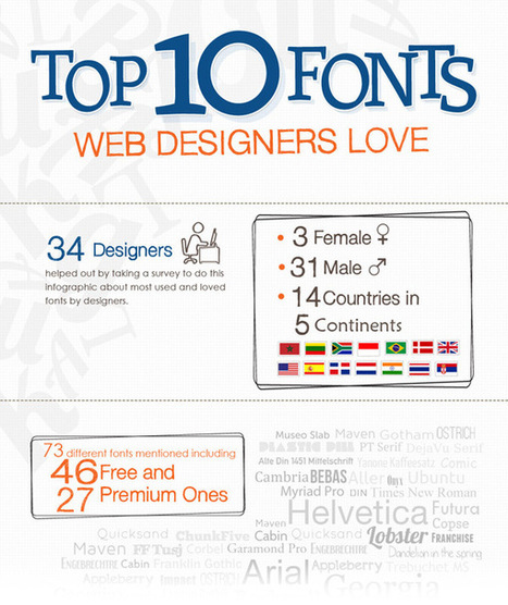
Top 10 Fonts Web Designers Love

Top 10 Fonts Web Designers Love | Digital-News on Scoop.it today | Scoop.it
When I was starting out with Web and graphic design, I was always wondering about the fonts that real designers use.

Via Martin (Marty) Smith
Martin (Marty) Smith's curator insight, September 19, 2013 11:44 PM

Note where Hevetica comes in :).

Rescooped by Thomas Faltin from Education & Numérique
Scoop.it!

The top 20 data visualisation tools

The top 20 data visualisation tools | Digital-News on Scoop.it today | Scoop.it

From simple charts to complex maps and infographics, Brian Suda's round-up of the best – and mostly free – tools has everything you need to bring your data to life...

A common question is how to get started with data visualisations. Beyond following blogs, you need to practice – and to practice, you need to understand the tools available. In this article, get introduced to 20 different tools for creating visualisations: from simple charts to complex graphs, maps and infographics. Almost everything here is available for free, and \you may have installed already...


Very interesting.


Via Lauren Moss, Dennis Richards, Terheck
Randy Rebman's curator insight, January 28, 2013 12:33 PM

This looks like it might be a good source for integrating infographics into the classroom.