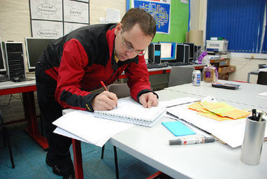
"Conveying information in a striking, concise way has never been more important, and infographics are the perfect pedagogical tool with which to do so. Below, you’ll find my experience with designing an infographic-friendly classroom research project, explained in a step-by-step process you can implement in your own classroom."
Beth Dichter's insight:
Infographics might be considered the intersection of information, illustration and design. They provide students with the opportunity to share information in a variety of ways. This post shares the story of one teacher and her implementation of a research project which culminated in an infographic. After a brief introduction (which includes an excellent interactive infographic, 13 Reasons Why Your Brain Craves Infographics). Following this introduction there are six components that are shared:
* Select an Infographic-Friendly Topic
* Begin the Drafting Process by Hand
* Choose the Right Templates or Software
* Refine Content and Design
* Infographic Resources and Tools for Educators
* Share and Critique
Each section provides additional detail and a number of resources that you will find helpful are included.
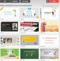
"PowerPoint is robust and Google Presentations is very sweet for collaboration, but some of us simply crave beautiful new design options for our presentations and publications.
Here are four worthy options, and another one about to be born."
Beth Dichter's insight:
Do you like trying new tools, specifically ones designed for presentations and publishing? This post, by Joyce Valenza, explores five tools that will provide a range of options for you to consider.
* Canva allows you to create slides, posters, flyers, presentations, business cards and more. With hundreds of fonts, one million images, photo editing, the ability to collaborate and more you may want to head over to Canva and create an account...and it is free!
* LucidPress comes from the same folks that created LucidChart, and it is free for educators (and your school can also get accounts for students). This is a robust a robust publishing tool that has been getting rave reviews...definitely worth checking out. If you have questions, check out their tutorials.
*emaze is a new tool out in beta. The website states that you can choose a template and quickly create a presentation. Featureinclude the ability to translate text, HTML5 (so it should run on any browser), and multi-device accessible.
*Haiku Deck was originally designed for the iPad but is now has a web based version. The folks who designed this were looking for an application that would allow them to create a "killer pitch deck" and when they could not find one they chose to create one...thus Haiku Deck.
* Powtoon Slidesis due out later this week. Based on a sneak peek you will find lots of slide templates, infographic style that includes animated icons that you can use on graphs and charts, a photoshow style (with over 3 million royalty free photos available), and an animated style. This list does not include all features but it may make you want to head over to Powtoon and check it out!
More information on these tools is available in the post.
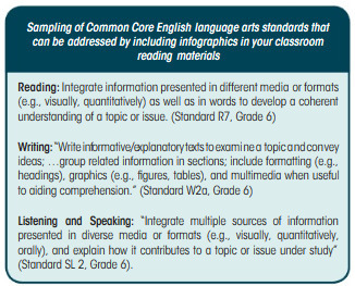
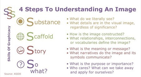
Infographics are modern, written artifacts about collected resources in a dynamic, visual format. Infographics should be viewed as complex, standalone texts, not simply a text feature or graphic element.
Beth Dichter's insight:
This paper looks at digital literacy, specifically how infographics can be used to meet Common Core standards. A well designed infographic will have:
* A Purpose
* A Style
* Evidence
* Format
The paper also includes a section "How can I teach comprehension with infographics?" This section includes two infographics and has the students critique them using the following questions:
* What is the author's purpose or question?
* What evidence supports the author's claim?
* What are the strongest elements of this design?
* How could the design be improved?
You could use these same questions and have students in your class critique their infographic and their classmates.
And last but by no means least they provide a list of locations where you can create an infographic.
Infographics support reading comprehension and writing skills. They also allow students to strengthen their critical thinking skills and synthesis skills.
Slightly overblown tone, presumably to help what is a useful overview of infographics sound more "academic" - read between the lines for what students should think through and how they should approach their own infographic production
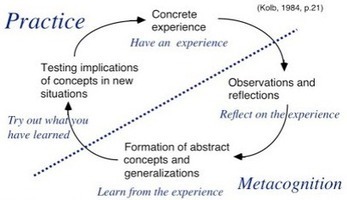
"According to Indiana University Bloomington, Inquiry-based learning is an “instructional model that centers learning on a solving a particular problem or answering a central question. There are several different inquiry-based learning models, but most have several general elements in common..."
Beth Dichter's insight:
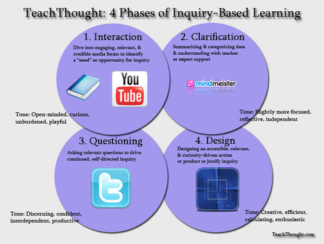
This indepth post explores inquiry-based learning. The four phases are:
1. Interaction - Big Idea: Dive into engaging, relevant, and credible media forms to identify a “need” or opportunity for inquiry
2. Clarification - Big Idea: Summarizing, paraphrasing, and categorizing learning with teacher or expert support
3. Questioning - Big Idea: Asking questions to drive continued, self-directed inquiry
4. Design - Big Idea: Designing an accessible, relevant, and curiosity-driven action or product to culminate and justify inquiry
Each of the four phases also includes information on tones, student indicators, teacher indicators, appropriate questions and apps.
There are also 4 questions for student-based reflection and ten adjustments you may make as a teacher to adjust to teaching inquiry-based learning.
There are many forms of teaching that incorporate inquiry-based learning including project-based learning, blended learning, and challenge-based learning. You may find your students more engaged in the learning process if you include some components of inquiry-based learning in your classroom.
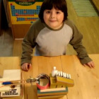
Check out this post (and the embedded YouTube video) where a 7 year old (who wants" to study robotics at MIT and become a theoretical theorist") designs a Rube Goldberg machine to trap a monster. His description of a Rube Goldberg machine is "a machine that creates a complicated chain reaction to do a simple task." Using a wide variety of materials, including marbles, tubing, pencils, a toaster, books, balls, a paper roll and more he shows us his creativity and ingenuity...as well as resilience. He also shows an understanding of the scientific method, sharing his hypothesis and more. I suspect that many will share this video with others in their schools.
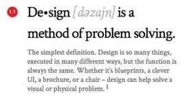
Good design - what is it and how does it impact our classroom? This post explores the principles of design, providing many ideas on how we might incorporate them into our classroom, stating "Well designed classrooms and educationa plans can have a positive impact on educational outcomes."
Twenty-five design principles are listed with an explantion and how you might incorporate it in your room.
Are you interested in learning the design process? The five-week virtual class will share the tools and methods of the process. With creativity being the top item wanted by many CEOs this has the potential to provide you with resources you may use in your classroom. Edutopia, IDEO and New York's Riverdale Country Day School have teem up to offer this free course. For more information check out the article at GOOD. To see the workshop schedule and register for the course you may go directly to http://www.edutopia.org/design-thinking-workshop-schedule. Move quickly, the course starts on July 30th!
Ooops...I just checked and the course has sold out...hopefully they will offer it again.
So what is critical design literacy and why is it needed? This article states "Critical design literacy applies the protocols of design thinking to practice social innovations that lead to social transformation. In the learning environments that we will pilot we want students to become literate in critical thinking and critical designing. The former encourages students to look at their community through an inquisitive lens while the latter encourages students to design for community impact."
Points on how to practice digital literacy, a look at how to redesign K-12 environments and designing for equity are also discussed.
"One of the challenges we run into again and again in our teaching is the 'forest for the trees' pitfall...we stress both core facts and larger themes. This seemingly dual focus can sometimes puzzle our students as they try to internalize one notion or the other. Ideally, we try to show how the details and the ideas are actually the same thing. Or to borrow the words of the furniture savant Charles Eames, 'The details are not the details. They make the design.'"
Rich with resources and links this article explores how using design in our classrooms "combines all the top-tier thinking skills, such as creativity and ingenuity."
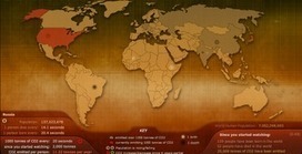
The ASIDE blog takes a look at population using a variety of data visualizations: The Miniature Earth Project, Who is the World's Most Typical Person?, and Breathing Earth. All are "eye-catching presentations of images, data and design. The clarity and simplicity in the use of information mixed with sound, be it music or sizzling emissions, coalesce into an effective message. Their delivery engages the viewer to think and ask questions, and our students are fascinated by each one."
Dream up the coolest thing to make your life more awesome. Finalists will pitch their idea in person to will.i.am and other special guests. One lucky winner will see their idea come to life with support from a lead design and innovation agency. You may enter in teams of up to three or individually. Entries due by March 28, 2012.
Most visualizations end up as passing follies that are significant in the short-term, but in the long-run they fade to the background with the rest of the noise.
We are always talking about the ideal education should be a learner-centered setting. Learners can be in charge of their learning with options to different paths and paces. Learners will participate in the designing of their learning processes. So the first thing of all is that they have their voices heard. More and more teachers have their students reflect on their own learning experience.
Shows how something extraordinary can be achieved, provided we have some more time. :-)
Beth Dichter's insight:
How do you teach creativity? This video may not show how but it does let us know that to be creative takes time. In just over 2 minutes see the difference when assigning a task for a short period of time or for a more extended period of time. If we want our students to be creative we need to give them the time to BE creative. The question is, where do we find this time?
"We love infographics. We love animation. And we’re all for engaging kids in creative education. So today we’re looking at three educational infoviz animations that shed light on complex or important issues in beautifully art-directed ways that make little eyes widen and little brains broaden."
Beth Dichter's insight:
If you are looking for three great infographics that are animated this post is for you.
The first video is 'How to Feed the World' and explores "the science behind eating and why nutrition is important." The suggested ages are 9 - 14.
The second video, 'The Story of Stuff' is a fascinating look at "the entire materials economy." This is a longer video (just over 20 minutes) but it provide a great base for a classroom discussion. If you click through to their website you will find many other videos that have been created including 'Story of Bottled Water', 'The Story of Solutions' and 'Story of Electronics.'
The third video is 'Meet the Elements,' a "wonderful animated journey across the periodic table."
There is a fourth video but it is not necessarily appropriate for students (at least younger students). This one is a reinterpretation of LIttle Red Riding Hood.
If you know of some great videos for teachers to use share them by leaving a comment!
"Canva is a new service that makes it easy to create beautiful slides, flyers, posters, infographics, and photo collages. Creating these graphics on Canva is a drag-and-drop process. Start by selecting a template then dragging and dropping into place background designs, pictures, clip art, and text boxes."
Beth Dichter's insight:
Canva is in beta but their response for an account is usually done within 3 or 4 days. Create slides, flyers, posters, infographics and more and download them or link to the online graphic. You may upload your own images or use from their collection. This looks like a quick and easy way for you or your students to create media for classes or activities that take place in your school.
"Imagine a world where digital learning platforms help adult learners succeed through college completion; where a network of schools offers international-quality education, affordable tuition, and serves hundreds of thousands of children in economically disadvantaged countries; where we engage parents in understanding national trends and topics in education; where a comprehensive learning environment seamlessly connects the classroom with the opportunities of the digital world for young students; and where system-level solutions help more students gain access to college."
Beth Dichter's insight:
What are the key elements of design thinking?
* Defining the problem
* Creating/considering multiple options
* Refining selected directions
* Executing best plan of action
Teaching students design thinking "empowers students to realize that they can create their own futures by borrowing frameworks from other areas, which allows them to design their own participation and experiences."
This post provides links to 45 design thinking resources. If you are thinking of using design thinking in your classroom this year, or if you already use it you will find many great resources on this list.
In education, design thinking empowers students to realize that they can create their own futures by borrowing frameworks from other areas, which allows them to design their own participation and experiences.
How can the iPad and Project Based Learning (PBL) come together in a classroom? Here is a post that explores how you may use PBL and the iPad in your classroom. There is a great visual that is "laid out in terms of the kind of workflow a learner might encounter in a 21st century, K-20, project-based learning environment."
There are so many tools now available to help you make your own infographic, and this post shares information on ten tools that will help you visually represent data. For each tool a short description is provided as well as a visual. The tools discussed are: Visual.ly, Dipity, Easel.ly, Venngage, Infogr.am, Tableau Public, Photo Stats (for iPhone), What About Me? (create an infographic about your digital life), Gliffy, and Piktochart.
Ten great tools that will allow you to create (or have your students create) infographics for this school year!
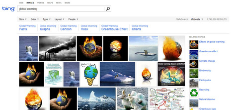
Bing has just made a major update to their image search. Roll over the image with your mouse and it will be magnified. The filter bar is easier to access and related topics are provided as well as trending topics. This is definitely worth checking out.
What happens when you spend summer designing a course as a video game? In this TEDxBozeman Paul Andersen describes his experience along with lessons learned, lessons that apply to flipped classrooms. The video is about 11 minutes in length and worth watching.
App Inventor lets you develop applications for Android phones using a web browser and either a connected phone or emulator. The App Inventor servers store your work and help you keep track of your projects.
You build apps by working with:
* The App Inventor Designer, where you select the components for your app.
* The App Inventor Blocks Editor, where you assemble program blocks that specify how the components should behave. You assemble programs visually, fitting pieces together like pieces of a puzzle.
* Your app appears on the phone step-by-step as you add pieces to it, so you can test your work as you build. When you're done, you can package your app and produce a stand-alone application to install.
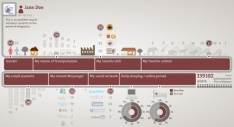
Infographics make excellent tools to use in the classroom to help students understand complex information in a graphically appealing way...what can you use to design them that would help explain how images and data come together to portray information visually? Simple, have students make a graphic about themselves using IONZ.
This article explains the IONZ website in detail with some screen shots, or you can choose to go directly to the website: http://www.ionz.com.br/index.html. Make sure to click on the British flag in the upper right hand corner for the English version.
Innovative design crosses over all aspects of education. The American Society for Innovation Design in Education, or ASIDE, seeks to infuse curriculum with new approaches to teaching and thinking.
To get content containing either thought or leadership enter:
To get content containing both thought and leadership enter:
To get content containing the expression thought leadership enter:
You can enter several keywords and you can refine them whenever you want. Our suggestion engine uses more signals but entering a few keywords here will rapidly give you great content to curate.


 Your new post is loading...


Very cool