Eclectic Technology
224.6K views | +5 today
Eclectic Technology
Tech tools that assist all students to be independent learners & teachers to become better teachers
Curated by Beth Dichter
Your new post is loading...
Scooped by Beth Dichter
Scoop.it!

ASIDE: Data Visualized: Simple, Quick, And A Range Of Topics

ASIDE: Data Visualized: Simple, Quick, And A Range Of Topics | Eclectic Technology | Scoop.it

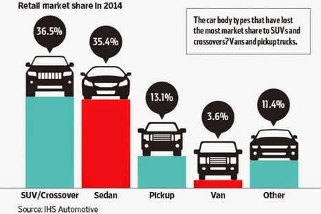
"We continually look for resources to use for “mini” lessons or “do nows” to help learners interpret data and draw conclusions through visual analysis.
The Statshot column in the weekend edition of The Wall Street Journal provides just that. David Goldenberg compiles the data, and the graphics are designed by Carl de Torres. The topics run the gamut, including pop culture, finance, technology, and science."

Beth Dichter's insight:

Finding great graphs to use with students is sometimes difficult. The Wall Street Journal may be the place to turn. This post shares examples of 3 graphs published in their  Statshat column.  This appears to be a new feature since the first publication is dated May 9, 2014.

These graphs will be useful for elementary and middle school. If you teach high school you may want to check out "the Numbers blog (which) examines the way numbers are used and abused,” and the topics are equally as diverse as those on Statshot."

Melissa Marshall's curator insight, August 7, 2014 11:58 PM

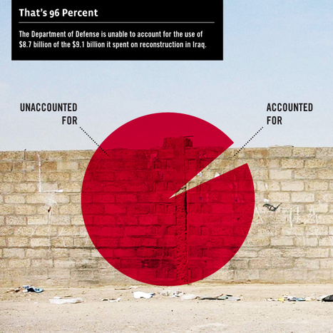
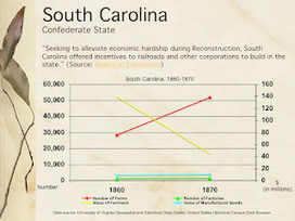
Here are some great graphical resources found in the WSJ! Obviously some are quite Americanised but there are some great ones you could use for a discussion on statistics, skewed data or how data is used in the media to reinforce a bias. 

Indy Home Vault, LLC's comment, October 1, 2018 10:08 PM
this is so useful article
Scooped by Beth Dichter
Scoop.it!

Infoviz Education: Animated Visualizations for Kids

Infoviz Education: Animated Visualizations for Kids | Eclectic Technology | Scoop.it

"We love infographics. We love animation. And we’re all for engaging kids in creative education. So today we’re looking at three educational infoviz animations that shed light on complex or important issues in beautifully art-directed ways that make little eyes widen and little brains broaden."

Beth Dichter's insight:

If you are looking for three great infographics that are animated this post is for you.

The first video is 'How to Feed the World' and explores "the science behind eating and why nutrition is important." The suggested ages are 9 - 14.

The second video, 'The Story of Stuff' is a fascinating look at "the entire materials economy." This is a longer video (just over 20 minutes) but it provide a great base for a classroom discussion. If you  click  through to their website you will find many other videos that have been created including 'Story of Bottled Water', 'The Story of Solutions' and 'Story of Electronics.'

The third video is 'Meet the Elements,' a "wonderful animated journey across the periodic table."

There is a fourth video but it is not necessarily appropriate for students (at least younger students). This one is a reinterpretation of LIttle Red Riding Hood.

If you know of some great videos for teachers to use share them by leaving a comment!

No comment yet.
Scooped by Beth Dichter
Scoop.it!

Innovation Design In Education - ASIDE: Designing Infographics Easel.ly

Innovation Design In Education - ASIDE: Designing Infographics Easel.ly | Eclectic Technology | Scoop.it

Are you interested in seeing some infographics created by students using the tool Easel.ly. This post not only share some infographics created by 4th and 8th grade students using Easel.ly it also explains the parameters that were set as well as hte goal. Students were able to learn to use Easel.ly in one period, and the "only instruction given to each class was a sample infographic of what needed to be included."

Additional links to other resources is also provided, including  a link to a page that includes additional tools you might use to create infographics as well as links to a wide range of infographics based on subject.

No comment yet.
Scooped by Beth Dichter
Scoop.it!

Create Infographics and charts - interactive data visualization | Infogr.am

Create Infographics and charts - interactive data visualization | Infogr.am | Eclectic Technology | Scoop.it
Infogr.am is a super-simple tool for data visualization - creation of interactive infographics and charts...

Another tool to create infographics...they just seem to keep coming. This one provides a range of themes and says more features will be coming soon.

No comment yet.
Scooped by Beth Dichter
Scoop.it!

The Goldilocks Effect - Visualizing Just The Right Amount: ASIDE

The Goldilocks Effect - Visualizing Just The Right Amount: ASIDE | Eclectic Technology | Scoop.it

"Whether they realize it or not, our students are inundated with numbers. It can be hard for them to get a handle on the competing streams of information from tech and social media. One way they can learn to negotiate this "Age of Big Data" is by becoming familiar with the different types of charts and displays..."

Providing simple tools and suggestions of sites with resources this post explores the taxonomy of graphs and ways to guide students on how to look at graphs.

No comment yet.
Scooped by Beth Dichter
Scoop.it!

Over 100 Incredible Infographic Tools and Resources (Categorized)

Over 100 Incredible Infographic Tools and Resources (Categorized) | Eclectic Technology | Scoop.it
I love a good infographic! After all, knowledge is power and the visualization of data makes absorbing information all the easier. Well-designed infographics have a way of pulling me into a subject...
No comment yet.
Scooped by Beth Dichter
Scoop.it!

Are infographics ruining the web?

Are infographics ruining the web? | Eclectic Technology | Scoop.it
At SXSW Interactive, there has been a lot of discussion about data visualizations. The industry has exploded in the last 2 years and is quickly becoming both a preferred way of distributing large chunks of data as well as the bane of content crea ...
No comment yet.
Scooped by Beth Dichter
Scoop.it!

Cool Infographics 2011 Gallery

Cool Infographics 2011 Gallery | Eclectic Technology | Scoop.it
Data visualization and infographic designs featured on the CoolInfographics.com blog in 2011...
No comment yet.
Scooped by Beth Dichter
Scoop.it!

The Internet in Real-Time: How Quickly Data is Generated

The Internet in Real-Time: How Quickly Data is Generated | Eclectic Technology | Scoop.it
From tweets to likes, see how fast data is generated every second on the internet in this interactive visualization.
Beth Dichter's insight:

Check out this interactive visualization and see how quickly data is being generated online. You may want to snap some screen shots and have your students determine how quickly Twitter accounts are created, hours of YouTube videos are uploaded, items are purchased from Amazon and much more. A total of 23 sources are being updated second by second.

Maryalice Leister's curator insight, May 28, 2014 2:40 PM

This graphic is an excellent discussion catalyst when talking about how far and fast information travels.

Scooped by Beth Dichter
Scoop.it!

Discovering Stories Hidden In Numbers - Another View on Charts

Discovering Stories Hidden In Numbers - Another View on Charts | Eclectic Technology | Scoop.it

Why do we ask students to create charts? Perhaps to help them tell a story. Charts and graphs help students understand data through visualization. Many websites exist today that help students create charts and graphs. This post explores a variety of resources and shares some graphs made by 8th graders. Once again ASIDE has put together a robust post with excellent resources.

No comment yet.
Scooped by Beth Dichter
Scoop.it!

10 Fun Tools To Easily Make Your Own Infographics | Edudemic

10 Fun Tools To Easily Make Your Own Infographics | Edudemic | Eclectic Technology | Scoop.it

There are so many tools now available to help you make your own infographic, and this post shares information on ten tools that will help you visually represent data. For each tool a short description is provided as well as a visual. The tools discussed are: Visual.ly, Dipity, Easel.ly, Venngage, Infogr.am, Tableau Public, Photo Stats (for iPhone), What About Me? (create an infographic about your digital life), Gliffy, and Piktochart.

Ten great tools that will allow you to create (or have your students create) infographics for this school year!

No comment yet.
Scooped by Beth Dichter
Scoop.it!

How to Choose the Best Chart for Your Data

How to Choose the Best Chart for Your Data | Eclectic Technology | Scoop.it

"Numbers don't lie, but a bad chart decision makes it extremely difficult to understand what those numbers mean."

So think before you select your your chart type...what message are you presenting? What will be the best arrangement to display the information? How should the chart be formatted?

This article provides many tips and ideas on how to go about creating a chart that will allow your information to be presented clearly.

No comment yet.
Scooped by Beth Dichter
Scoop.it!

5 Great, Easy to Use Tools for Infographics

5 Great, Easy to Use Tools for Infographics | Eclectic Technology | Scoop.it

"Tools for Data Visualization
One of the most frequent questions I get is “How can I start creating infographics? Where to start?”. Well, this article is exactly about “Where to start”, as as well as how to get inspired and how to start experimenting with visual-based data.
If you are worried that creating an infographic will be too hard, you should be pleasantly surprised by these tools. All of them pretty much do the work for you, and yet the end result is professional looking."

No comment yet.
Scooped by Beth Dichter
Scoop.it!

Innovation Design In Education - ASIDE: Eye-Catching Views of Population

Innovation Design In Education - ASIDE: Eye-Catching Views of Population | Eclectic Technology | Scoop.it

The ASIDE blog takes a look at population using a variety of data visualizations: The Miniature Earth Project, Who is the World's Most Typical Person?, and Breathing Earth. All are "eye-catching presentations of images, data and design. The clarity and simplicity in the use of information mixed with sound, be it music or sizzling emissions, coalesce into an effective message. Their delivery engages the viewer to think and ask questions, and our students are fascinated by each one."

No comment yet.
Scooped by Beth Dichter
Scoop.it!

Infographics & Data Visualizations | Visual.ly

Infographics & Data Visualizations | Visual.ly | Eclectic Technology | Scoop.it
Like infographics and data visualizations? Visual.ly is the world's largest community of dataviz and infographics. Come explore, share and create.
No comment yet.
Scooped by Beth Dichter
Scoop.it!

Piktochart- Stories from Data. Your presentation/data visualization tool.

Piktochart- Stories from Data. Your presentation/data visualization tool. | Eclectic Technology | Scoop.it
CREATE ENGAGING PRESENTATIONS

Piktochart easily creates WOW presentations out of your data.

No comment yet.